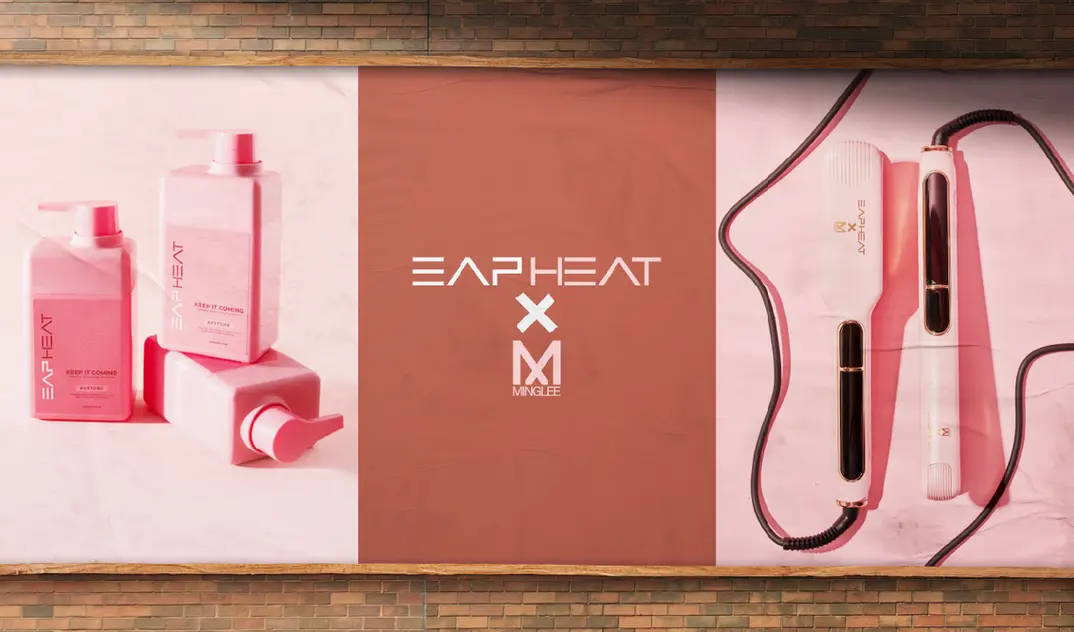
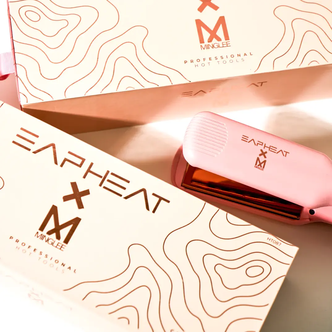
EAP HEAT
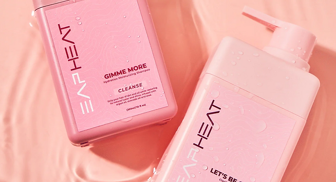
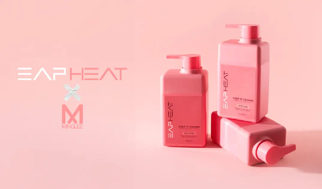
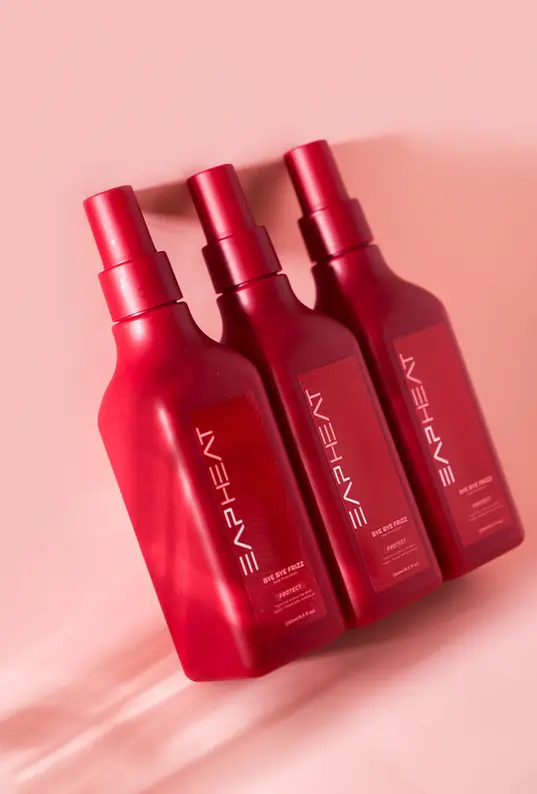
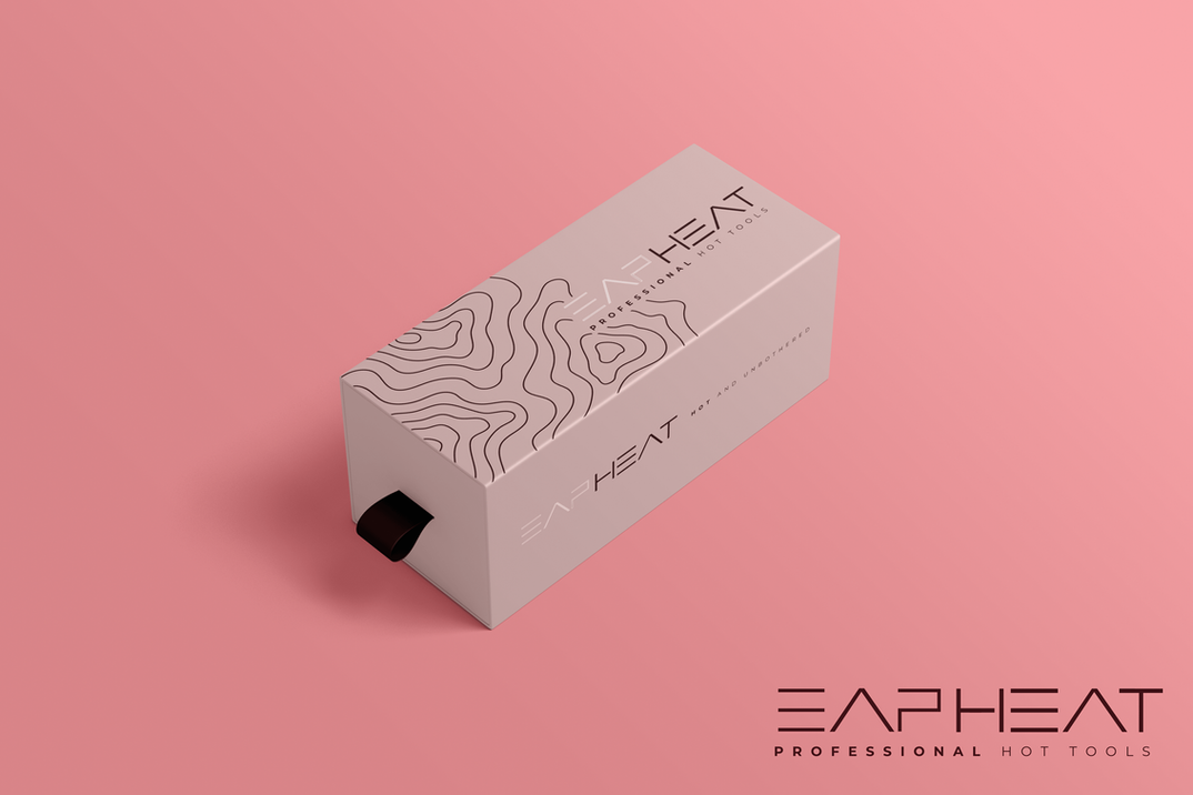
Our agency collaborated with EAP HEAT, a bold and innovative multicultural hair care brand, to execute a complete brand refresh and elevate their product packaging. At the heart of this project was the creation of their signature heat map—a visual element that underscores EAP HEAT’s commitment to evenly heating hot tools designed to protect and enhance textured hair.
We began by conducting an in-depth market analysis, uncovering key insights into beauty industry trends, consumer behaviors, and competitive positioning. These findings guided our approach, ensuring EAP HEAT’s refreshed identity would resonate with its diverse audience while setting the brand apart in a saturated marketplace.
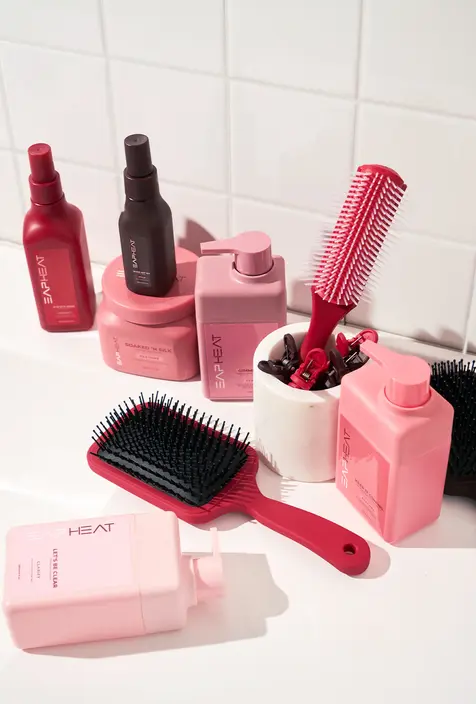
The rebranding process included reimagining the logo, color palette, typography, and packaging to reflect a sleek, contemporary aesthetic that celebrates inclusivity. We also developed a compelling narrative that highlights EAP HEAT’s mission to empower individuals to embrace their natural beauty while providing tools that prioritize hair health.
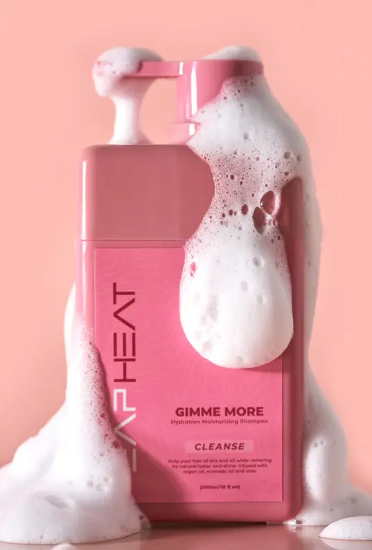
The product packaging was designed with intention—combining functionality with style. The incorporation of the heat map not only reinforced the brand’s technological edge but also created a cohesive visual identity that communicates innovation and care at every touchpoint.
From concept to execution, this project was about more than aesthetics—it was about creating a brand experience that aligns with EAP HEAT’s values of quality, empowerment, and sustainability.
This version is concise yet impactful, focusing on the key elements of the project while emphasizing your agency’s strategic and creative contributions. It highlights the heat map as a central design feature while weaving in EAP HEAT’s mission and values to create an emotional connection with the audience.

.png)
.webp)

.svg)
.png)


