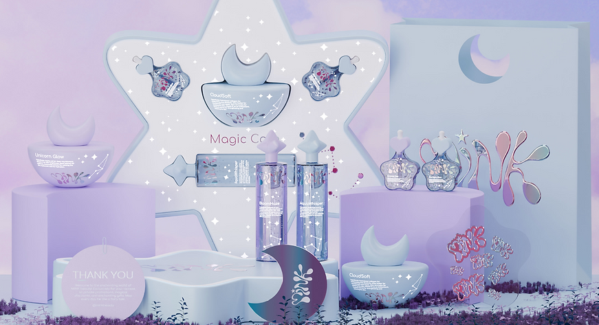
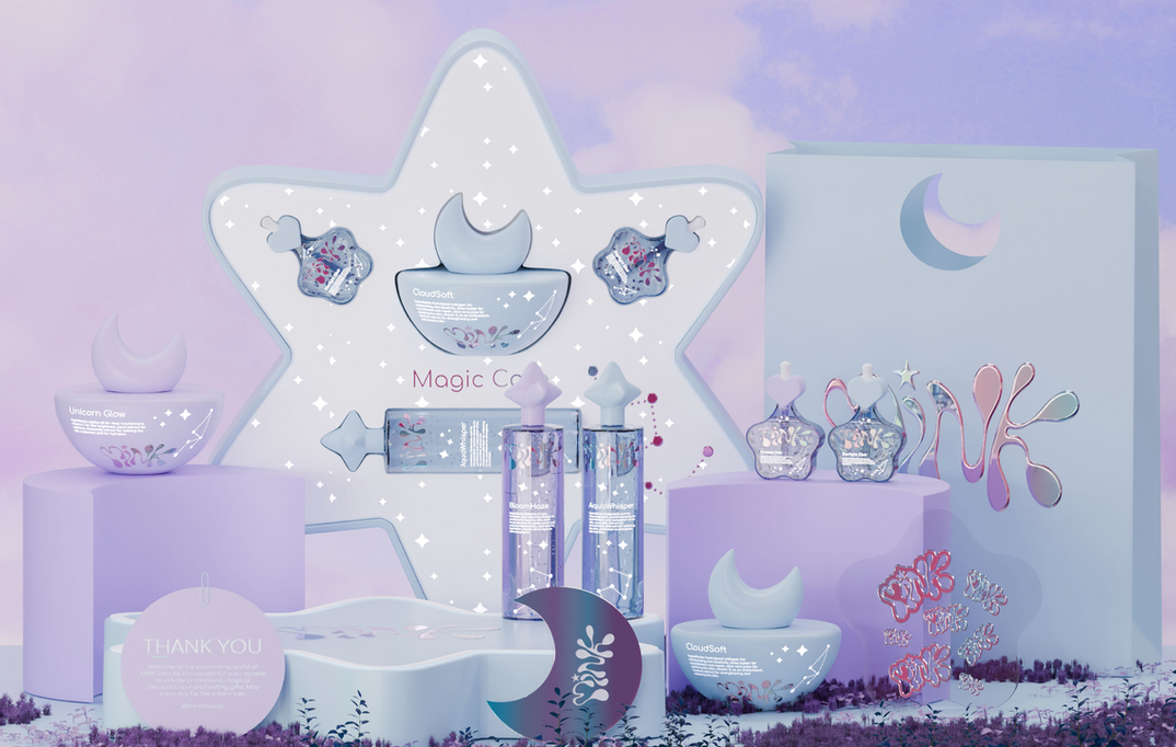
MINK
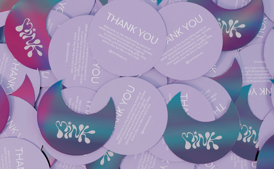
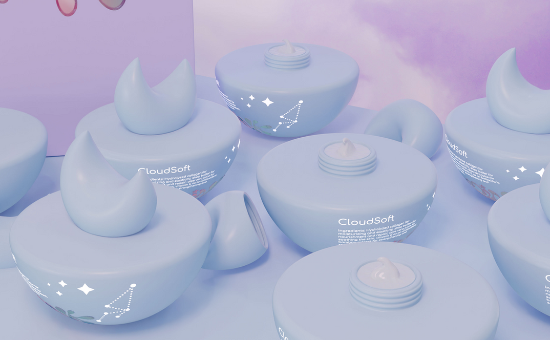
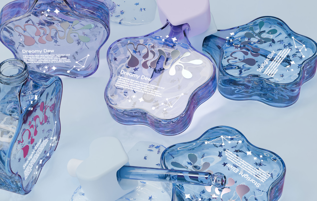
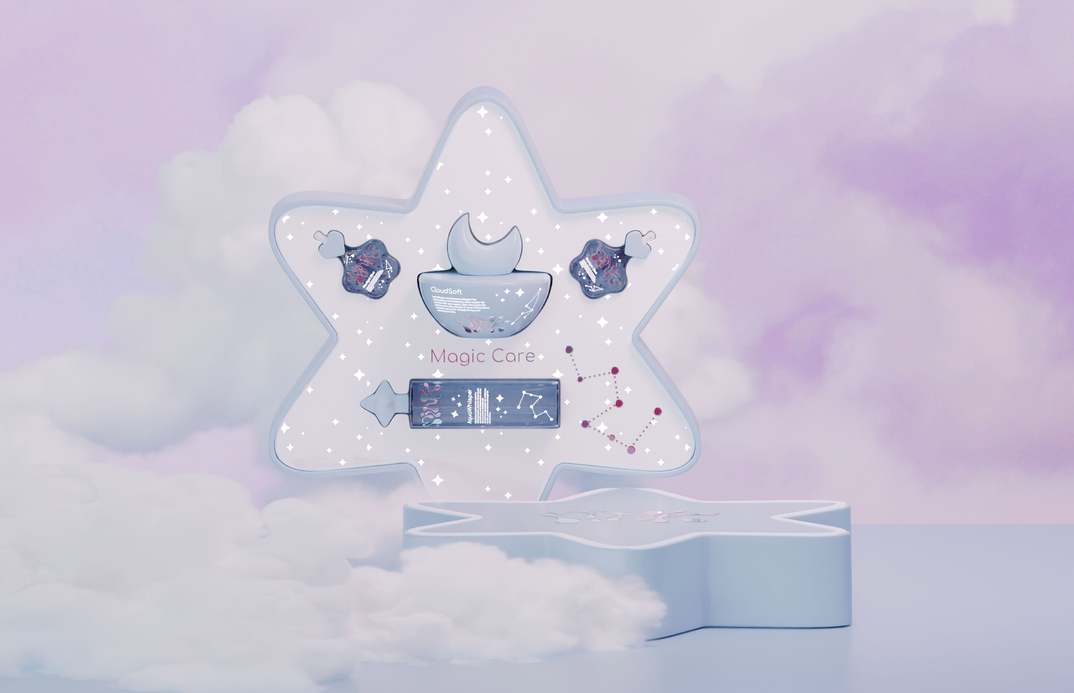
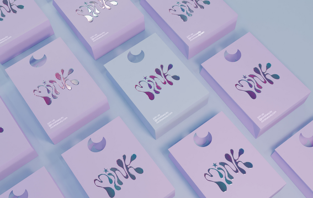
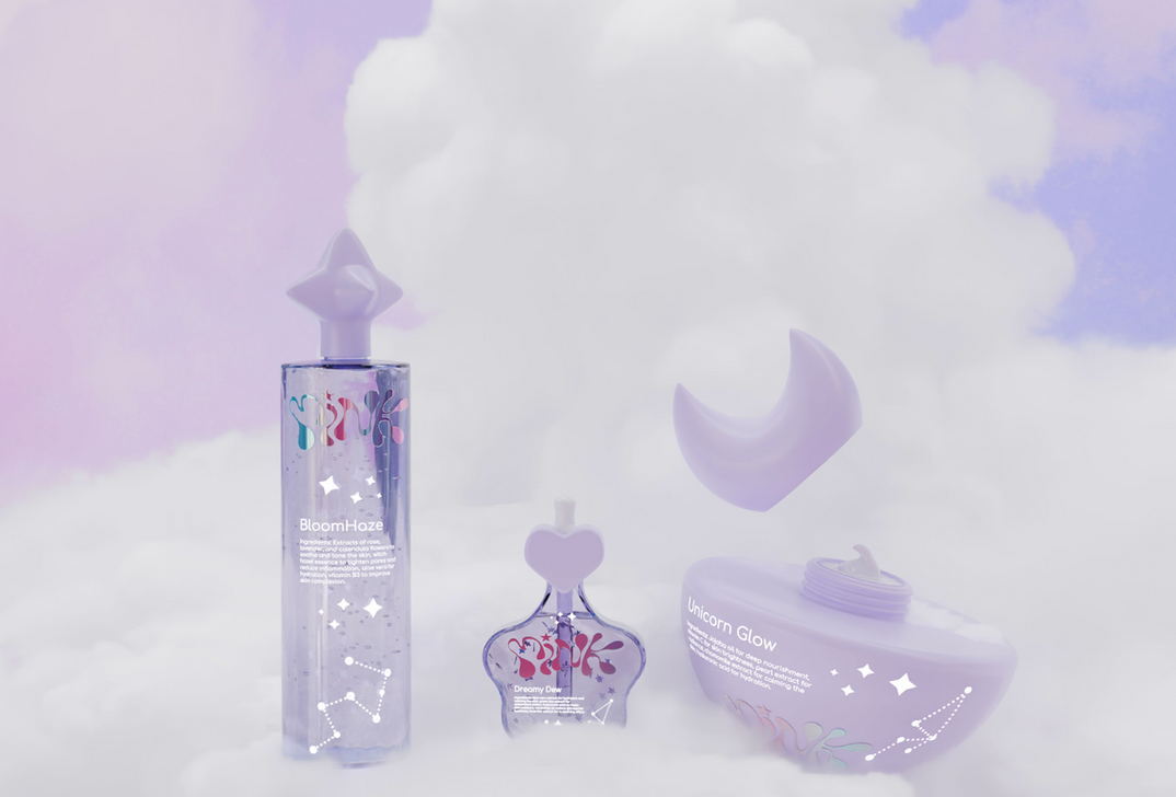
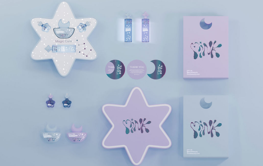
Our agency embarked on an innovative collaboration with Mink Beauty to create a packaging and brand identity design that would resonate deeply with their Gen Z-focused skincare line. Recognizing the unique preferences and values of this discerning demographic, we developed a visual language that seamlessly blends playfulness with sophistication. The centerpiece of our design strategy was a soft, light periwinkle color palette that imbues the packaging with a dreamy, ethereal quality, perfectly aligning with Mink Beauty's commitment to gentle, effective skincare. This soothing backdrop serves as a canvas for more dynamic elements, including playful star shapes that adorn both the outer boxes and product bottles, creating a cohesive and visually striking brand narrative.
To further elevate the brand's appeal to its Gen Z audience, we incorporated cutting-edge design techniques that speak to this generation's appreciation for digital aesthetics and tactile experiences. A holographic logo, paired with a distinctive drippy-effect font, adds a futuristic and whimsical touch to the packaging, creating a striking contrast against the pastel backdrop[1]. This juxtaposition of ethereal softness and modern flair not only captures attention on crowded shelves but also conveys Mink Beauty's unique positioning as a brand that understands and caters to the multifaceted nature of Gen Z consumers. By integrating these elements, we've crafted a brand identity that not only stands out in the competitive skincare market but also forges an emotional connection with its target audience, positioning Mink Beauty as a forward-thinking, relatable brand that speaks directly to the values and aesthetic preferences of Gen Z skincare enthusiasts.

.svg)