.png)
Speak Up Conference
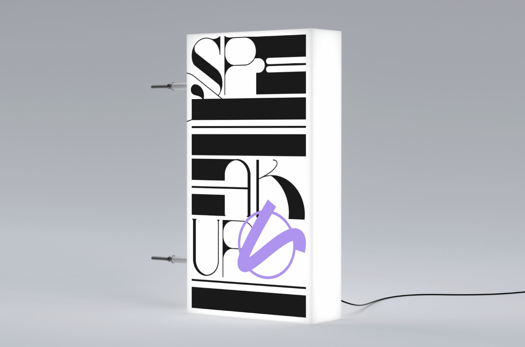
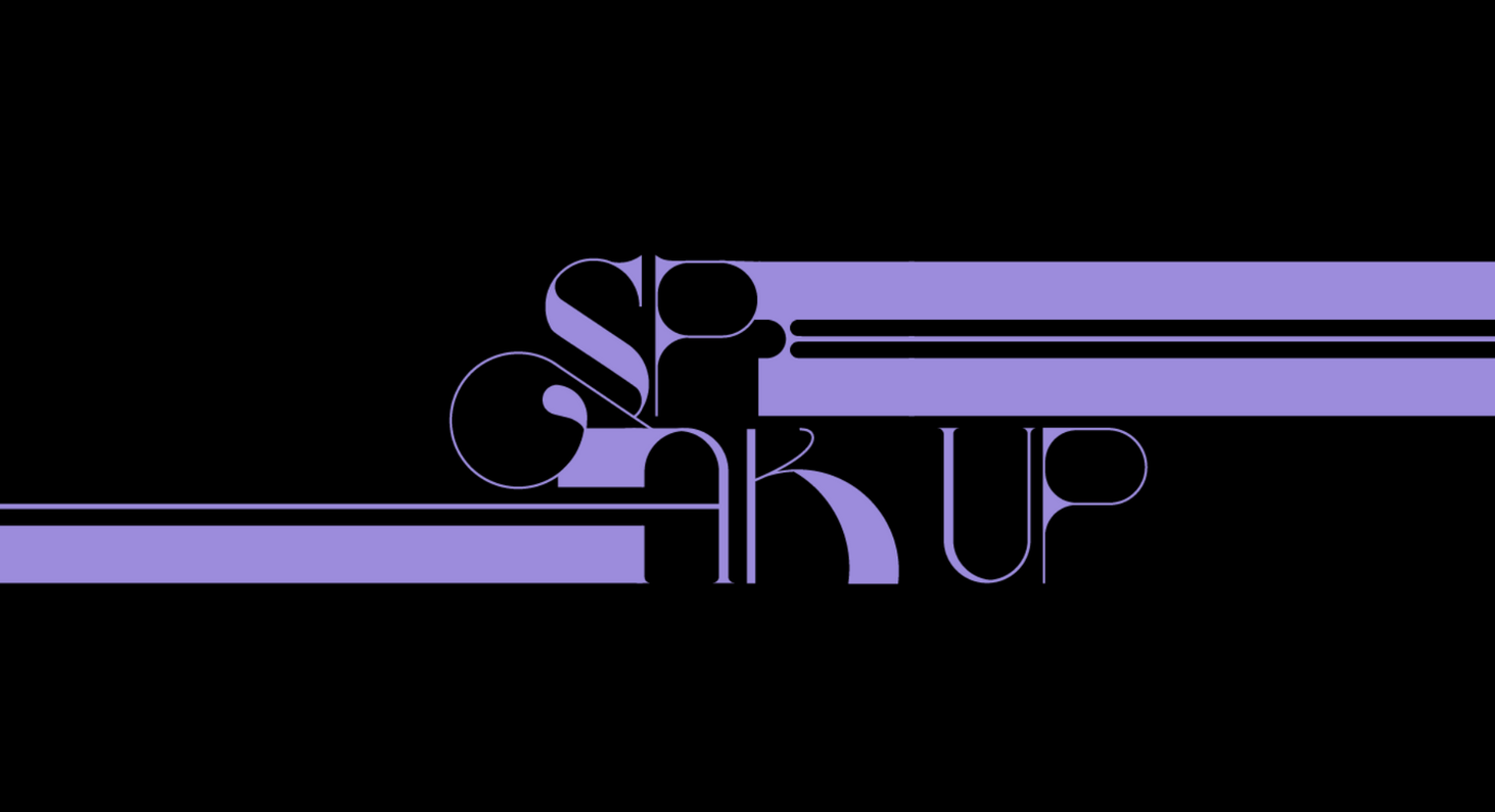
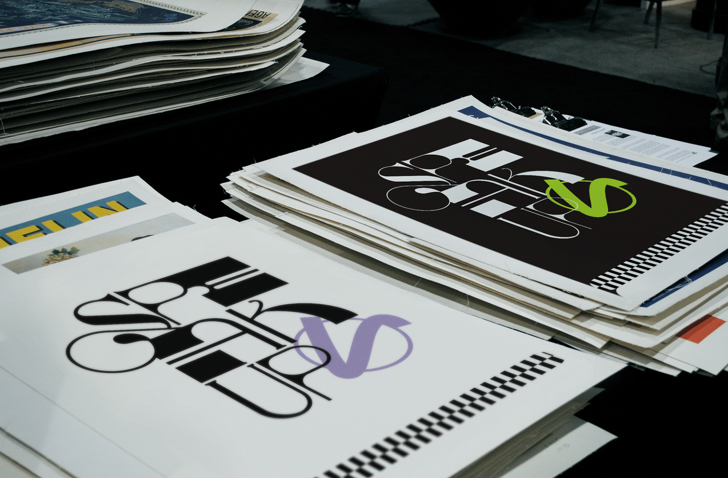
The Speak Up Conference has emerged as a premier youth-focused Christian gathering, drawing young believers aged 18 to 30 for an annual weekend of transformative worship and fellowship. This dynamic event has become a cornerstone in the spiritual lives of youth, offering a unique platform for connection, growth, and celebration of faith. Recognizing the need for a visual identity that would resonate with its vibrant audience, the conference organizers collaborated with our agency to create a bold, multicolored brand that captures the essence of youthful energy and spiritual awakening.
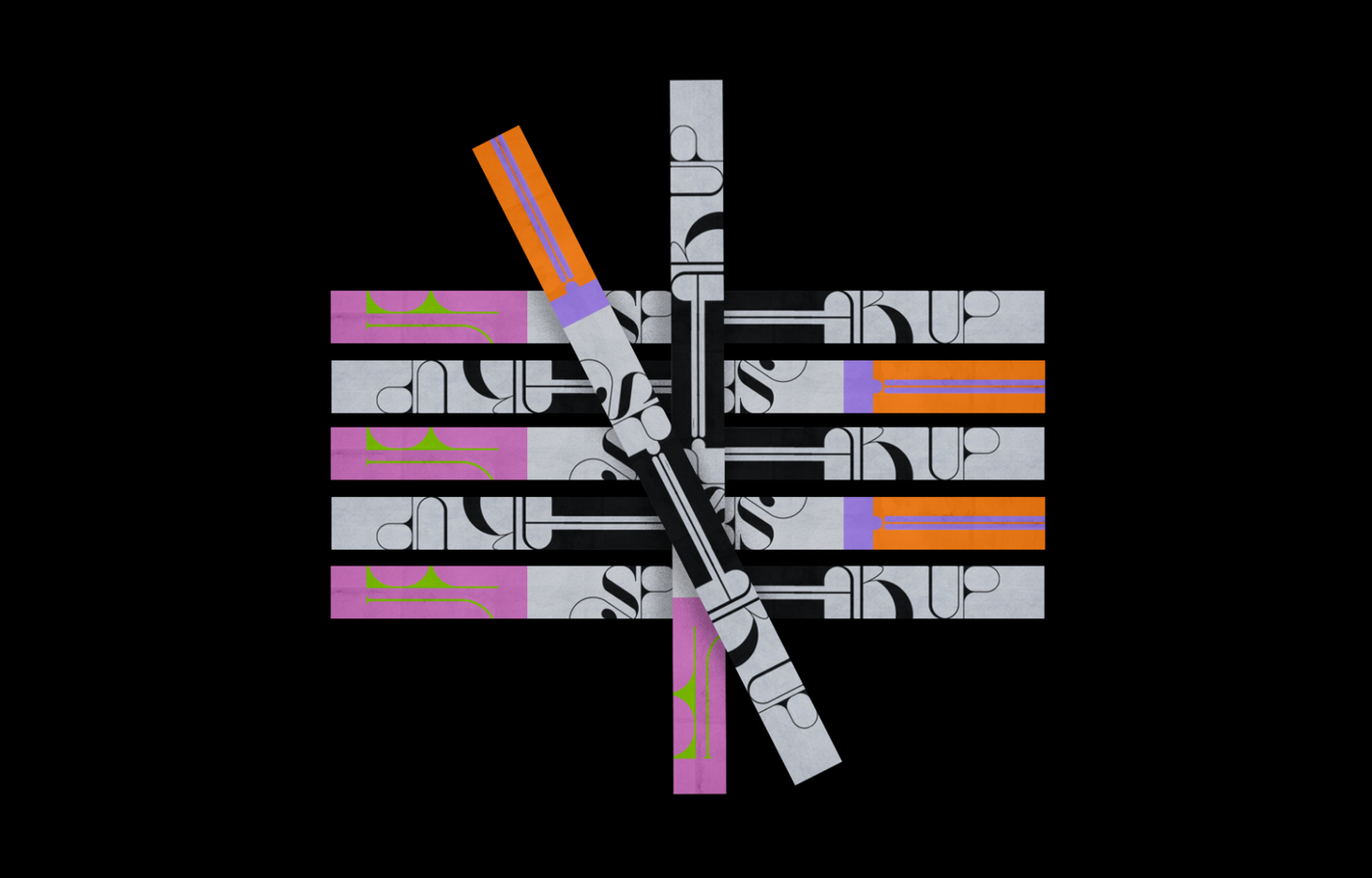
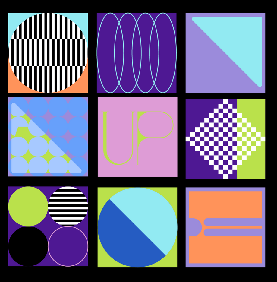
Our innovative approach resulted in a striking visual identity that seamlessly blends clean, geometric elements with a vivid color palette of purple, orange, green, and blue. The centerpiece of this design is a custom lettering piece for "Speak Up," which showcases the power of typography in creating a meaningful and visually captivating brand. This dynamic identity not only reflects the conference's energetic atmosphere but also serves as a powerful tool for attracting attention and increasing engagement among the target demographic. The public's enthusiastic reception of the new branding has significantly boosted the conference's visibility, contributing to its growing popularity and solidifying its position as a must-attend event for young Christians. Through this thoughtful and contemporary design approach, Speak Up Conference has successfully created a visual language that speaks directly to the hearts and minds of its youthful audience, fostering a sense of belonging and excitement that extends far beyond the event itself.
.png)
.png)
%20(2).png)
.png)
.png)
.svg)